Want to be a web designer? When your family and friends go home for the first time you want to make a good impression, right? You try to offer them some snack you like and have everything neat and clean. The same thing should happen with your web design.
You actually have very little time to get users’ attention before they leave your page. According to Nielsen Norman Group, users only read 20% of the words on a website. So, if yours is messy and does not have a clear message or a call to action. Users will go somewhere else immediately.
How to improve web design

Add a value proposition
The value proposition communicates to your visitors what you do and why you do it.
Put your value proposition on the homepage of your website, as a headline if possible. Add it also to your blog and in your social networks. You have to make your users know exactly what they will get if they hire you, if they buy your product, if they subscribe to your newsletter or if they read your blog.
According to the research of Content Marketing Institute, our value proposition should include the following elements:
Our company.
Our audience.
What information.
What a benefit.
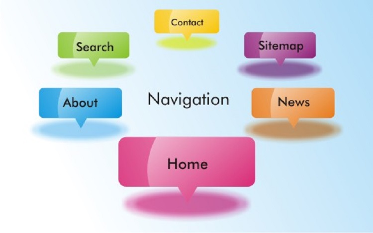
Website navigation
The navigation of your web has two purposes:
Help the user find what they are looking for.
Improve your search engine ranking.
Your visitors should always be your priority. Use descriptive navigation that speaks the language of your users. Do not use jargon. You must be empathetic and know how to choose the words they would use to find your products.
The design of a web will be better how many fewer clicks the user has to make.
Empathy is the greatest marketing skill.
Call-to-action text
The call to action is one of the most important elements of web design. Once you have the users on your website interested in what you do. You should tell them what you want them to do.
Calls to action usually appear in the form of buttons with the following texts: “Download it now”, “Get a free sample”, “Subscribe”, “Open an account”, etc. The text of the button must begin with a verb. Otherwise, it is not a call to action. “More information”, for example, is not a call to action.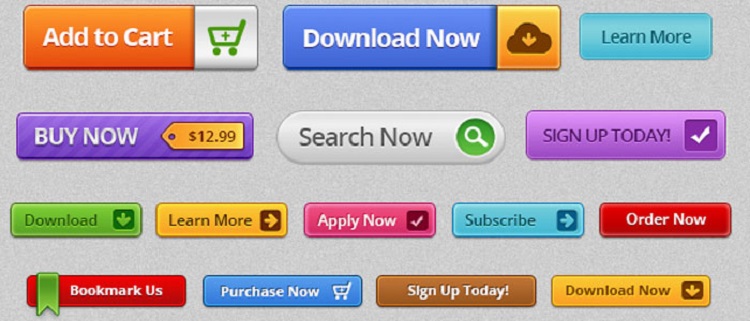
The colors of the CTA
The CTA button should highlight the rest of the elements of a web design. A good idea is to use complementary colors. This way you will be sure to get the attention of the user.
The distance test
Open your web page in the browser, get up from your desktop and take ten steps back. Could you tell what your company does with just a look? If not, you need to support your message and be more specific.
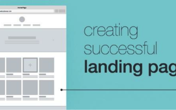
Unbouncy is a good example of this technique. When you open your website, you know exactly what you can get: “Build a landing page quickly and get more conversions”.
Social Testing
Use social evidence and testimonials so your potential customers have one more reason to trust your company. Try to include these testimonials in the home. So that, users can see it the first time they visit your website.
About us page
Like social proofs and testimonials, the “Who We Are” page gives a trustworthy point to your website. Let your visitors know who is behind the company.
In addition, the use of individual team pages gives you the opportunity to rank in search engines when users search for those names specifically.
Mobile-friendly
Google updated its mobile search ranking algorithm. Mobile-friendly web pages are now ranked higher in search results for mobile devices. So, make your web design mobile friendly.
And there is a good reason for it. Google wants users to have a good experience when they browse a website. So, if you do not have a mobile version of your page or a responsive website you will be missing out on many conversion opportunities.
Internal Linking
Do not let your users reach a dead end on your website. Keep them always moving. All pages must contain a link or contact form. The home page should link to all others. It is a good idea to also include the name of the landing page on the link. So that, the user knows where they will be headed once they click.
Long journeys
Many web design and online marketing professionals believe that important information should be placed above the fold of the page. But scrolling down is a natural action on internet users.
Yes, more attention is paid to the things above this cut because it is the first thing you see for web design.