Last June, Apple took the step to introduce us the new developments of the next generation of its mobile operating system, iOS 10. We have been testing it on various devices since its first beta until today. So, we have taken advantage of to make a complete analysis of the news and the experience of use that will contribute.
Devices Compatible with iOS 10:
iPhone:
- iPhone 6s.
- iPhone 6s Plus.
- iPhone 6.
- iPhone 6 Plus.
- iPhone SE.
- iPhone 5s.
- iPhone 5c.
- iPhone 5.
iPad:
- iPad Pro 12.9 “.
- iPad Pro 9.7 “.
- iPad Air 2.
- iPad Air.
- iPad 4th generation.
- iPad 3rd generation.
- iPad 2.
- iPad mini 4.
- iPad mini 3.
- iPad mini 2.
- iPad mini.
iPod:
- iPod touch.
- iPod touch (6th generation).
IOS 10 brings several changes, new applications and features that are sure to please many, if not all. However, it is their nice changes that are most striking. In spite of being very similar to the latest versions of iOS, we will find details that will modify the experience in the day to day.
Mobile operating systems have advanced a lot in recent years. We have reached a point where its evolution seems to have stopped. IOS 10 is no exception. Apple has known how to change certain aspects while giving developers more freedom to others to improve the user experience.
IOS 10: Design

As I mentioned, the aesthetics of iOS 10 remains very similar to what we have seen since iOS 7. It’s clear and colorful interface is almost complete. However, if we look closely, we will find that there are several changes. Those visuals that completely change the patterns we have learned for almost a time.
When you install iOS 10, the first thing you’ll notice is that the way we’ve known for years to unlock the phone is gone. That “Slide to Unlock” that brought so much debate when it came out. Now says goodbye for a simple “Press Home to Unlock.” If we think about it, the slip to unlock died with the arrival of the Touch ID, and with the 6s was the final stake. This system is so fast, efficient and secure. Sliding the screen to unlock the phone no longer makes any sense.
Analog iOS 10 Press to Unlock
Your home screen also changes. Not as “drastic” as the Slide to Unlock but now we will see that it is divided into three panels. The central one that is the Lock screen itself and depending on where you slide your finger. You will find the camera or the widgets panel for quick access Without the need to unlock the phone. Up to iOS 9, we obtained the camera on the unlock screen in the lower right corner. But, in iOS 10 to activate it just slide your finger to the left.
Notifications now also look different
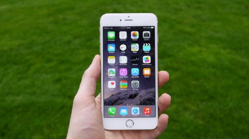
These have a much clearer design than in iOS 9. But to everyone’s surprise, now they are not grouped but divided by days. Something that is annoying and hopefully they change their minds at some point. On the other hand, these notifications are now more interactive and allow you to expand and show a lot more interaction. However, this feature is planned to expand the 3D Touch in the system further. So, it will be somewhat more annoying for those who have an iPhone or iPad without this feature. It is clear that 3D Touch is essential for Apple. So, we will see how it integrates more and more into iOS.
Something important with the arrival of iOS 10
It is that you will no longer have to manipulate to see the notifications on the unlock screen as this new update brings the function of “Raise to Wake.” It allows you to pick up the phone you can see the notifications you have on the screen without worrying about giving the Home button. They disappear automatically when the phone is opened. The widgets that we found in the Notifications Center have also improved a lot. Being more useful and showing more information in their new enlarged format.
Control Panel
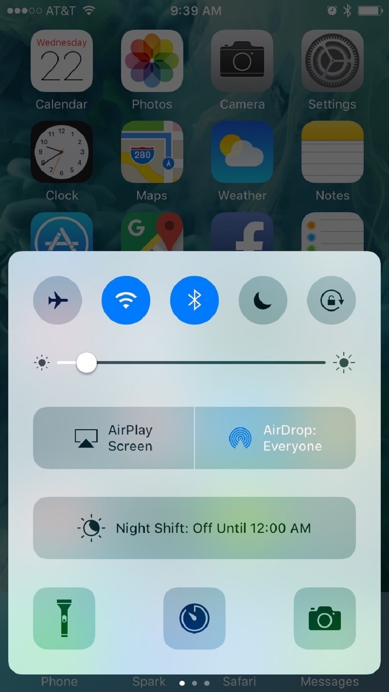
The Control Panel receives a substantial change. Accessing it – sliding the finger from bottom to top – no longer find a single panel of shortcuts. But now Apple divides it into three panels. The first remains reasonably intact, except for Music that is now on the second panel. The third panel is dedicated to Home Kit and its new application. This third panel will only appear for those who have configured the application and with smart devices in your home. It should be noted that in the first panel, Apple also adds the use of the 3D Touch in the shortcuts of the bottom like the flashlight, clock, and calculator, among others. Too bad we will still be waiting for a quick check to enable or disable battery saving, but hey, at least we can ask Siri to activate it for us.
Finally, although it is not about design, they do contribute to the new experience that wants to offer iOS 10. This new version includes new sounds that have been changing along the different betas. These new sounds will be found in the keys of the keyboard, even the erase has a different sound to the rest, or to turn off the iPhone, which now has a shorter sound, sober and dry. It’s a tiny detail, but the simple fact of changing that mute sound, it looks like you have a new phone.
IOS 10: What’s new
Not all are aesthetic changes. Apple also includes several important additions in the applications section. Apps like iMessage, Maps, and Photos among others receive new functions, aesthetics and options. We will also find Home, a new application for those already on the Internet of Things with which you can configure scenes. It controls various devices or devices in the home or establishes routines. Moreover, you can finally delete the pre-installed Apple apps.
Before entering into each of the applications that receive substantial changes. I must add that, in general, the new applications and news included contribute to a richer experience. Although before each application was just an icon on our home screen that we touched when we wanted to use it. Now many of these are more proactive to provide us information using 3D Touch for faster actions.
iMessage
It is one of the applications we use most in our day to day. For this reason, Apple has given special attention to improvements that. They are more visual than functional, add a more fun and adapted communication experience to these times. So much so that many are looking forward to iMessage coming to Android. But that will not happen, at least not for now.
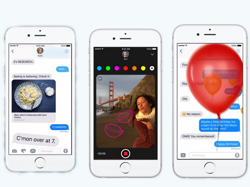
The new iMessage in iOS 10 opens to developers by allowing them to create applications for this like sticker, GIFs, and games, among others. It is about being able to communicate in new ways other than just typing. For example, you can reply with a “Like” or a “Hahaha” to a fixed message, send a message of Happy Birthday with bombs or confetti falling on the screen, or invite someone to our party with lightning Color changing lasers. One of the ones I like the most is being able to send hidden text. This option allows you to send a message that the recipient can see when you slide your finger on it.
For those who prefer to write a message in their handwriting, they can also do so by simply turning the phone or activate the manual option.
IOS 10 – Applications and Stickers for iMessage
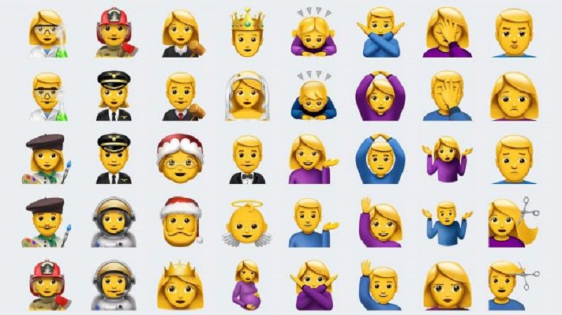
Of course, they are visual changes, but they do not stop adding fun to the messages. And hey, it’s all a pass. During all these months, I enjoyed using it with colleagues and colleagues who were testing iOS 10 as well.
The only drawback aside from not being available for Android is that these creative messages can only be used between devices iOS 10. That is, someone who has not updated, will not be able to use them and many will be sent as a regular message. End of the message chain, so in many cases the context will be lost.
The Photos app is also getting a lot of love in this new version of iOS
Many of the new features include due to Deep Learning and artificial intelligence that includes iOS 10. The options you present are just a new way to organize and find photos. Whether by location, people, date, etc. It also adds a function that I found quite satisfactory and very useful called Memories.
Another option that comes to the Photos application in iOS 10 is Markup. Through the extension, we will find this option that will allow making drawings of the photos. You know, for that cool touch to share on social networks, iMessage, WhatsApp and other similar applications.
Those who have used Google Photos will see that it is very similar. The only difference between the two is that the photos are not sent to Apple servers as in the case of Google, but the whole process is done on the iPhone or iPad itself. A new way to maintain user privacy.
IOS 10 – Home and HomeKit Application
In iOS 9 Apple introduced HomeKit, its platform for the Internet of Things and the connected home. However, he missed being able to have an application with which to control more easily the different devices and devices in the home. This is now solved with the new Home application.

In my house, I have some devices compatible with HomeKit like some Phillips Hue bulbs, among others. Before the arrival of this new app of Home, I tried several applications, some paid and others free. Home cannot be said to be the most complete or best application for controlling your HomeKit-compatible devices. Apple’s approach is one of the simplest and most useful ones I’ve tried.
When you open the application, you will see that it asks for access to the compatible devices. Once inside, it will allow you to create scenes in different rooms. Turn off or on the devices, set a schedule for them to be automatically activated or deactivated and more.
Home in iOS 10 will not be a complete application for this. it has everything you need for it, and it does it in a very simple and effective way. The best thing I can say about this is that I will not have to continue testing more applications.
My only criticism on this is that for those who have not yet started with the Internet of Things. It is strange some tutorial on how to start using it. I know that the Home app is simple, but what is simple for me, is not necessarily for you.
Maps
We know Apple had a very run-down Apple Maps launch. To the point that today people still remember it and have not used it again. I have used Maps since its launch, and I must say that it has improved a lot. Too. It still does not show the amount of information that we find in Google Maps, but it makes me quite precise when I go for a walk.
With iOS 10, Apple has added more features to its Maps application providing it with artificial intelligence to show us places of interest for eating, gas, hospitals, where we park our car and more. We only open it, we play what we want and ready. But perhaps the most important thing about this new Maps is that it completely changes its interface. It is one of the apps that have the most changes, and I add that they are very good. The application is simple, very useful with what it offers us and visually presents the most organized and easy to read information.

Siri
I think you cannot talk about a new iOS without talking about Siri. The virtual assistant who started it all gains new functions and learns new tricks. Many. Although for many it is not common to speak to a machine, for those who want to give the opportunity to know. Siri is much more proactive than ever.
Of all the new features that come with iOS 10, I would say that Siri is the centerpiece. And is that Apple has finally opened its virtual assistant to developers so we can get more out of it. That is, you will now be able to request an Uber or send a message dictated by WhatsApp, among many other options. However, all these features are not yet available and will depend on developers implementing it.
IOS 10: Experience of using
Even though iOS 10 is very similar in appearance to previous versions. It’s changing, both smaller and not so much. Contribute to give the best experience so far on an iPhone or iPad. And it is necessary to keep in mind that the fact that it is a new version does not necessarily imply that it will be better.
The experience in iOS 10 benefits greatly thanks to Deep Learning and the Artificial Intelligence. It is something that we will not configure on the phone, but it is Apple who is in charge of making all this magic work for us. Another example of this is that you will warn us where we park our car once we get off it or when you open the Maps application, we will have the option to find our vehicle.
On a daily basis, the new update is still very similar to the one we’ve seen since iOS 7. However, without fear of being wrong. I think iOS 10 is the most fun, smart and useful iOS we’ve seen until the moment.

