First of all, we will explain what a landing page is. A page that arrived after clicking from a link, a result in Google searches, an ad in AdWords, etc.
Objectives of a landing page
The primary objective of a landing page is to get the user to take a specific action when arriving at it, usually, buy, hire the product or service offered or contact. The important thing is to do the action for which the web page is created.

Central Objective
In order to fulfill the central objective. It is necessary to include in the landing page elements that favor the purchase of the product. The contracting of the service, the main element is the information about the content of the link from which it has clicked. It is also essential to call to action that carries a contact form for the user to fill. To purchase the product or to contact the service in question.
The web of a company should be focused on generating business and not as a place where they simply offer corporate information of this. In a web focused on the conversion, it is essential to have a perfect landing page that converts for each service or product that we want to sell to the user.
You may like also: How To Improve The Web Design With 10 Basic Strategies
Buyer or Lead
We call Landing page or landing page to the page designed to turn the user into Buyer or Lead. This is achieved through a form of exchange. We offer value information by obtaining a Lead or through which we get a sale by getting a sale directly.

In this case, we are talking about how to create a landing page that converts. But as much or more important is to get the user to reach it. We can have dozens of landing pages perfect, but if we fail to successfully bring the user to these, they will never convert.
A good base to start is to build our site so that the user can reach any landing page in a maximum of 3 clicks from the home page. For this, we must use CTA’s in the Home or each product/service page that we have in our sitemap. In this way from each product page, the user can access the related landing page to make their purchase or download.
There are different methods to take the user to these landing pages:
- SEM ads: This should be taken directly to our “LP” so that the user can make the purchase without clicking more.
- SEO: A Landing is more difficult to position since it must have low content, but we can position other product pages in which to place CTA’s that send the user to the concrete LP.
- CTA’s in our blog and product/service pages: CTA’s play a very important role because by placing them in the right places, we can get many visits to our landing pages.
- Social Media: As in the case of SEM ads, we must publish on our social networks using direct links to the LP.
There are more techniques, like external links, forums and a long etc.

The tactic is simple
Through any of the above techniques, we managed to take the user to the perfect landing page. Then, through a simple structure of information, we get the user to fill out the form. Once this has filled out the form, we must take it to a page of thanks in which we offer services or related products and in which you can access the document offered or the information of the payment made.
Perfect landing page strategy
We can also add an email of thanks. So that the user has all the information of the page of thanks in his email to safe deposit.
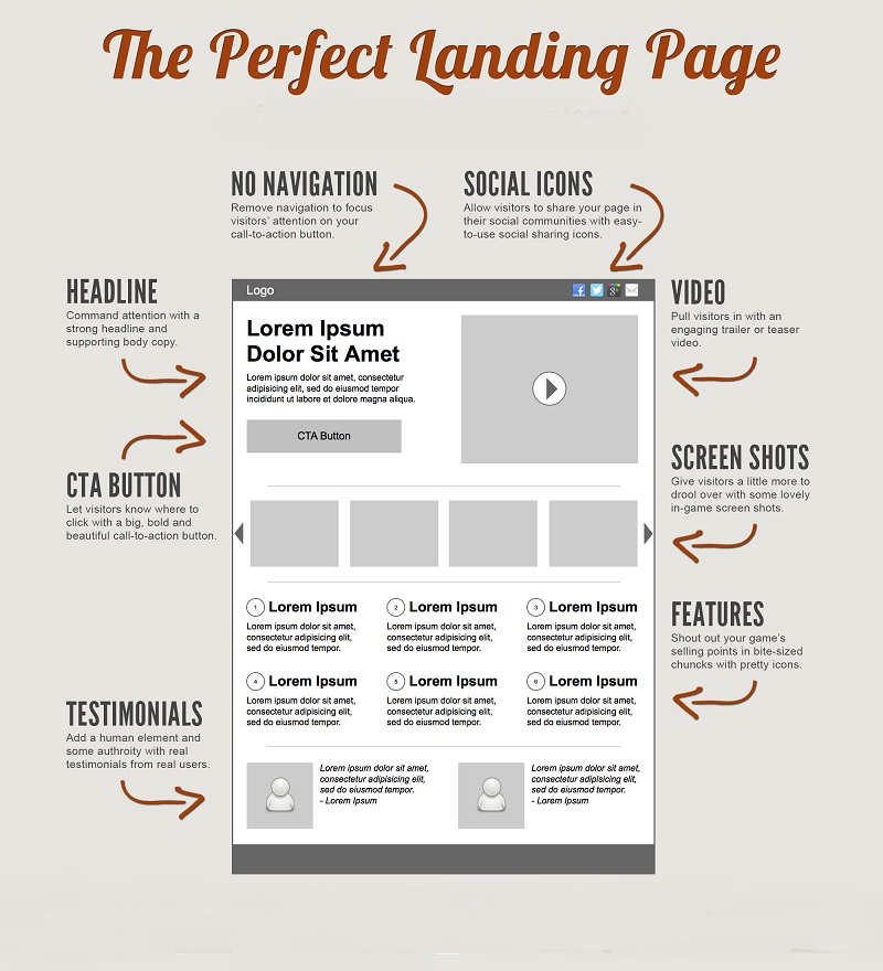
To get a Landing Page focused on the conversion. It should have a simple structure with little information so that the user’s view quickly reaches the form.
Read also: 5 important things new bloggers must do while blogging [Must Read]
This must consist of the following elements:
- Holder: A brief and concise headline (H1) direct to the user accompanied by a subtitle (H2) explaining a couple of lines. In both cases, it would be well to insert the keyword to position to strengthen the SEO.
- Benefits: A small list of the benefits of our product/service. So that the client can read it quickly and convince himself that he needs what we are offering. Also, these types of listings are very pleasing to Google.
- Image or video: It is imperative to add an image or video of the product or service that the customer is going to download/buy. An image brings a first visual impact of what the customer will find once the form is filled out.
- Download Form: The most important part of our Landing Page. The main objective is that the user gives us their data in exchange for the download of value that we offer. It is essential to make it visually highlight the rest of elements to attract the attention of the user. The fewer fields to fill, the higher the conversion rate we will get.
- Description: Never add a little text accompanied by an image explaining the product or download for the user undecided to arrive at this point. Ideally put it always at the bottom of the page.
- Links: In order for the user to have the least amount of navigation options possible. It is important to do without our navigation menu, eliminating or changing it for a shorter one. Only qualified traffic should be sent to a landing page. It is why we should not give you too many options.
Add elements
Another very important point besides these elements is that our landing page must offer all the elements on the screen. Without the need for the user to make any type of scroll. In this way, you will have a direct visual access without the possibility of error.
So that you have a more visual idea.
Advantages of landing page
The landing pages help a lot to measure the success of our campaigns on the Internet since through Google Analytics. We can know data as relevant as the number of people who access the landing page. The average time they stay in it and whether or not they do the scheduled action. We can also tell if they access us through computers or mobile devices.

Linking to a page that is not designed to convert will make the user arriving at your web page. It does not find easily what you are looking for. So the conversion rate will most likely decrease.
The attention page of the landing page should be the central element of the visual hierarchy of the entire page. The initial proposal of the landing page, the reason the user clicked on the ad to get there. It should be clearly placed on the page as the central element.
All the points listed above come to a fundamental conclusion
It is that each and every page of your website should design and consider as a landing page. SEO factors such as long tail will make users reach your website through any of its pages. It is not worth taking the risk that none of them cause a bad feeling. Remember that there are not two opportunities to make a good first impression.


